Ready for a Makeover?
A new year has us thinking about resolutions. There are the usuals--losing weight, be a better person, blah, blah, blah. And, of course, we have a list of things for the house. This year, we have to do some practical (boring) things, but we have some exciting plans for the garden. Since we always love a good makeover, we thought we would share some of the changes we made to Hound House since we purchased the home in September of 2014.
One thing you should know about us is that when we begin a project, we move pretty fast. The speed and efficiency is mostly thanks to Collin! He is a planner and a list-checker. Within four months we had the interior of the house pretty much where we wanted it. Ten rooms of wallpaper stripped, carpet in a couple of bedrooms ripped out, the kitchen completely overhauled, the entire house painted...that all happened in the first few days we owned the house. Collin was waiting at the house with a contractor while I was at the closing. As soon as I texted that the papers were signed, they got to work.
While there were many stressful moments, there was also a lot of excitement, valuable lessons learned, and an end result we are proud of. That said, with us, I'm not sure there is ever an end, "to be continued" is more like it.
After having a glimpse at some of the changes we made to the house you might be wondering about our design inspirations and process. We'll share about those in our next post along with some helpful design tips from Collin.
The entry has great bones and we love how it meanders around because of the additions made over the years. The stone floor is beautiful and the peg railing is a great little detail. We were not so keen on the crackle paint.
This photo was taken from the doorway just as the "before" shot. So you have a point of reference, the cabinet is against the same wall as the chaise. We wanted this moment to set the tone for the house The black wall behind the cabinet is an accent wall. The rest of the walls are painted in a lighter grey and the trim is painted black. Photo by Nora Murphy.
Off of the entry is a guest suite. It is a great size and such a luxury. It allows for us and our guests to have privacy since it is removed from the main part of the house. We removed the carpet and wallpaper so we would have a fresh slate to work with.
There was not a lot of work to do in this room. We love the circle sawn floors from Ghent Wood Products. We used the same flooring in the guest bath and our master bathroom upstairs. Photo by Ellen McDermott.
The living room is a light-filled space between the library and kitchen. The house has a center chimney and this is one of the three fireplaces it services. At first, we utilized the room as a formal living room, but eventually decided that we wanted it to be our primary living space.
We didn't touch the original floors. So, this room got a fresh coat of paint top to bottom and that was it. We recently made a few revisions, but we'll save those for another post.
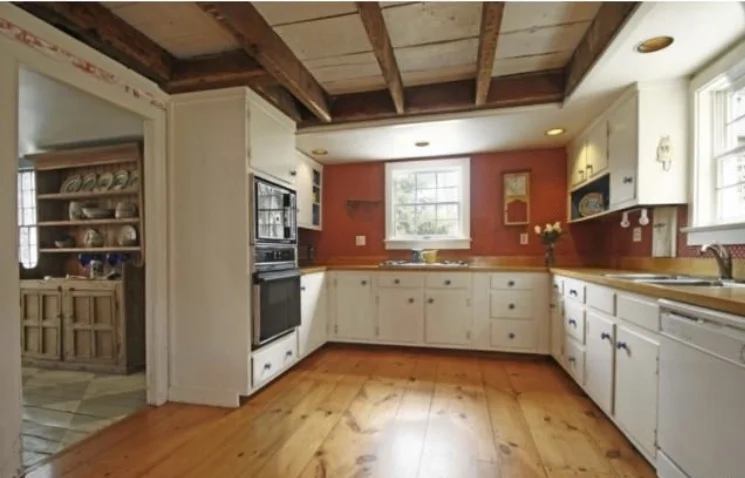
We love the country kitchen in the house. There is a huge fireplace and plenty of work space. The butcherblock counter tops and floors are beautiful details. The exposed beams add so much character to the room!
We wanted a certain feel in the kitchen--a bit of a nod to a service kitchen. The hand-made subway tile from Klaffs helped to achieve that look. We coated the cabinets with black paint, replaced the hardware with antique knobs and handles, added a farmhouse sink, and updated the appliances.
The fireplace and hand-painted floors in the room grabbed our attention. The room has a great energy!
You see that we didn't touch the floors. They have aged so very well! We used Wrought Iron by Benjamin Moore on the walls and all wood work to allow all of the details to stand out. The chandelier is by Restoration Hardware. Photo by Ellen McDermott.
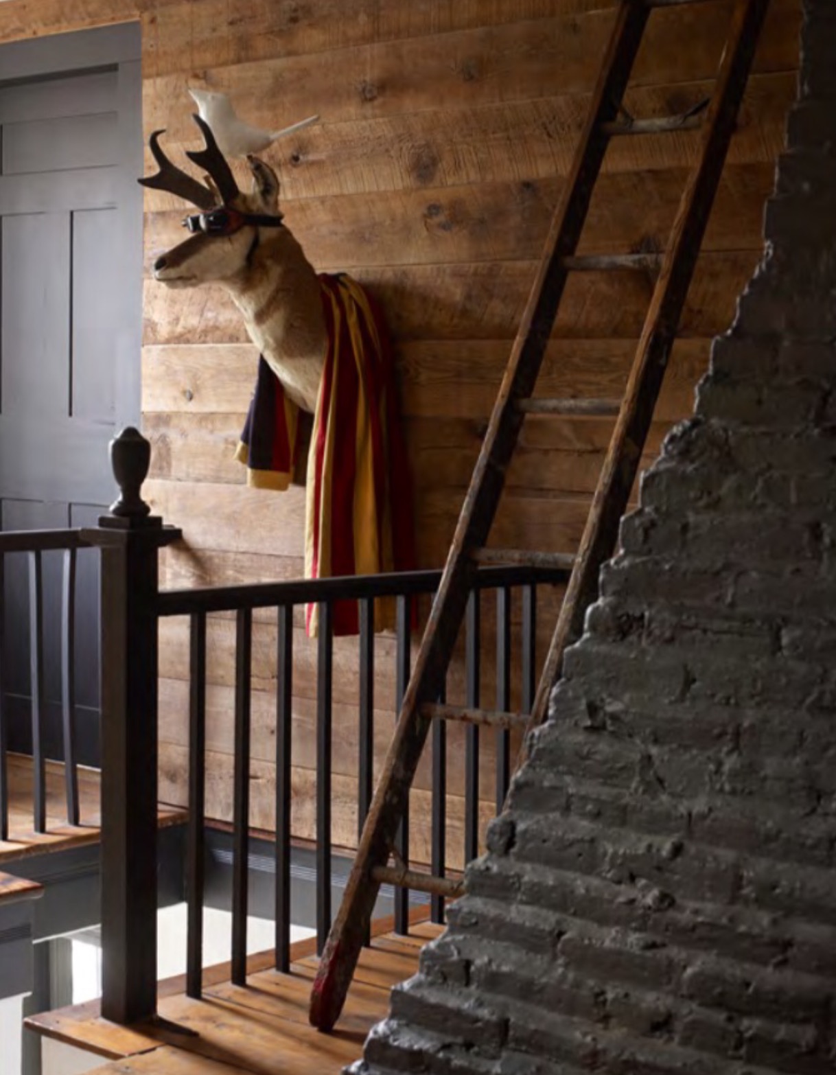
The upstairs landing. The faux treatment on the walls, light fixture, and woodwork needed a bit of attention.
We painted the woodwork in Obsidian by Restoration Hardware along with the exposed chimney. The walls are clad with mushroom wood from Ghent Wood Products. We wanted a warm, rustic space. Photo by Ellen McDermott.
This converted attic space over the Library was used as a home office.
We decided it would be a perfect dressing room. It gets great light. We took down the track lighting, painted the floors, walls, and ceiling Almost all of the doors throughout the house are painted Obsidian-you get a glimpse of the door here. Photo by Ellen McDermott.


