Hound House Inspiration
Photo by Ellen McDermott
We are often asked to describe our style at Hound House and the inspirations behind our interiors. It is hard for us to give a definitive answer because we don't fit into a nice, tidy box. Ultimately, we say, "It's just us." And, really, our style is the current version of us.
As we experience more life, more places, more art, and more people our style evolves.
To understand our design journey to Hound House, it might be interesting to see our previous spaces.
Our loft in New York was in the former printing press for G.P. Putnam and Sons, built in 1892. The fourteen foot ceilings and eleven foot windows led us to stay light and airy. We also went with a nod to mid-century design.
Photo by Todd Norwood
Collin loves playing with color. He also incorporates graphic elements into most of the spaces he designs. Some are very bold statements, while others are more nuanced. After living in a cramped Manhattan apartment for a number of years, the loft was a much needed change of scenery.
Photo by Todd Norwood
An escape...
For several years, we had been dreaming of a country house...a weekend get-away. That dream led to many trips up to the Catskills and the Hudson Valley hunting for houses. Finally, we happened upon a charming 1869 Victorian in the quiet village of Athens, NY. It was the perfect escape and re-immersed us into small town living. When it came to designing the interiors, Collin was inspired a bit by our Southern roots--we described it as Granny on acid. Color was a driving force behind the design as well as graphic punches. We also wanted a fair dose of whimsy. There were connections to the loft to give us that "city house, country house" feel.
Photo by Todd Norwood
Photo by Todd Norwood
Photo by Todd Norwood
The loft and the country house provided a moment in time that we needed, both emotionally and design-wise. As a designer, Collin moves through cycles of dark and light. When we first met in Dallas, he had a townhouse that had a dark, moody, minimalist feel--completely different from these spaces!
At this point in our journey, we desperately needed to be surrounded by color and light. We enjoyed the sophistication of the loft and the light-heartedness of the country house. We appreciated the lifestyle that each space inspired. As a designer, Collin needed the freedom to play and rediscover himself. Both of these homes provided those opportunities.
The next phase...
After five years of splitting time between the City and the Hudson Valley, we needed to simplify. We had to find a way to merge the two lifestyles we appreciated so much, but were also wearing us down. As we began our search, we knew we wanted an antique home, a manageable commute to NYC, and the charm of small town life.
We took this picture on the first day of our house hunt in Connecticut. We've made some changes to the exterior, but we'll save those for another post.
We love the character, history, and craftsmanship old houses provide. Since we would have one residence, we wanted a more refined look in our design...more controlled; however, we did not want to lose the sense of whimsy that we loved so much about the Victorian. When we found our 1790 farmhouse, we knew it would give us the opportunity to create the home that we needed at this point in our lives.
SOLD
Now, the fun part!!
Finding inspiration...
We have been infatuated with English country manors for a while. Our Colonial house lends a bit of that formality on a much smaller scale, so we decided to play with it. Collin dreamt up his own interpretation of what that design could look like as he perused books, magazines, Instagram, art, etc. I loved the direction! One day we came across a piece on Aynhoe Park in Oxfordshire, England. This fantastical estate provided the springboard that Collin was looking for.
Photos from Aynhoe Park
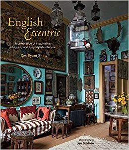
Additionally, Collin found himself returning to Ros Byam Shaw's English Eccentric over and over again. The layered, eclectic spaces captured his attention. He loved the use of antiques that were not overly precious and the soul that was found in many of the rooms featured in the book.
Color...to set the tone
We both agreed that we wanted a darker palette. Collin wanted to experiment with using different depths of grey throughout the house punctuated with black trim in most rooms. After searching for the right shades, we settled on several colors from Restoration Hardware.
Of course, we would need some pops of color (a signature of Collin's design). Those could come through in art and accessories, but we also wanted some rooms to stand out.
Collin's office is painted in a rich shade of green.
Photo by Ellen McDermott
And the library is a beautiful teal.
Photo by Lora Karam
While color can be a tremendously inspiring, it is impossible not to find inspiration from the 200+ year old floors, beams, doors, and other architectural details here at Hound House. Collin loves to juxtapose styles, colors, textures, etc. to amplify details. He constantly plays off of those rustic elements throughout the house.
Photo by Ellen McDermott
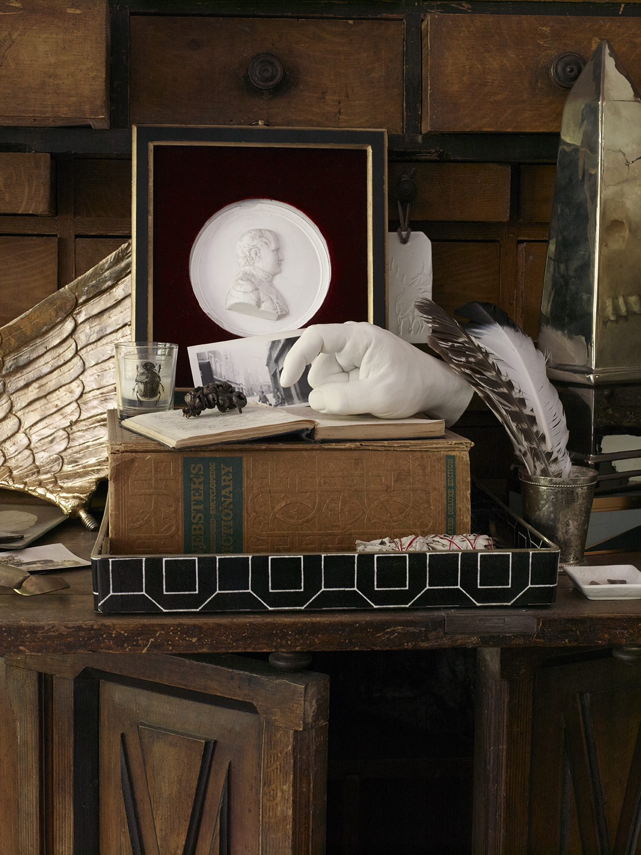
Somewhere along the way, we fell in love with cabinets of curiosities. We began to approach the entire house as one large cabinet of curiosity. We were inspired by "the collections of extraordinary objects which, like today’s museums, attempted to categorize and tell stories about the wonders and oddities of the natural world." This idea freed us to think about combining so much of what we love--from family heirlooms, to objects we've collected from nature, to more modern pieces of art--to tell our story room by room.
Photo by Ellen McDermott
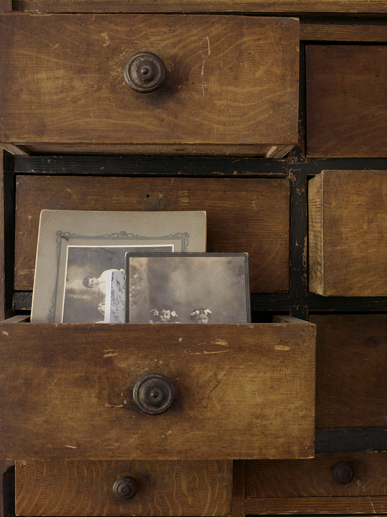
Now that we are in our forties and so far from our family in Texas, having old photos and special items that have been passed down is very important to us. There is something about these treasures that helps ground us and connects us back to our roots.
Photo by Ellen McDermott
Photo by Ellen McDermott
Finally, another source of inspiration was aspects of Dorothy Draper's approach to design. She once said, "I always put in one controversial item. It makes people talk." In our house, that piece is sometimes the elephant in the room (or the buffalo, or the giraffe, or maybe the raccoon). Other times, those items are not so obvious, but when they are discovered--boy, do people talk! And we love it!
Photo by Ellen McDermott


